Front
Back
02 — Poster Design
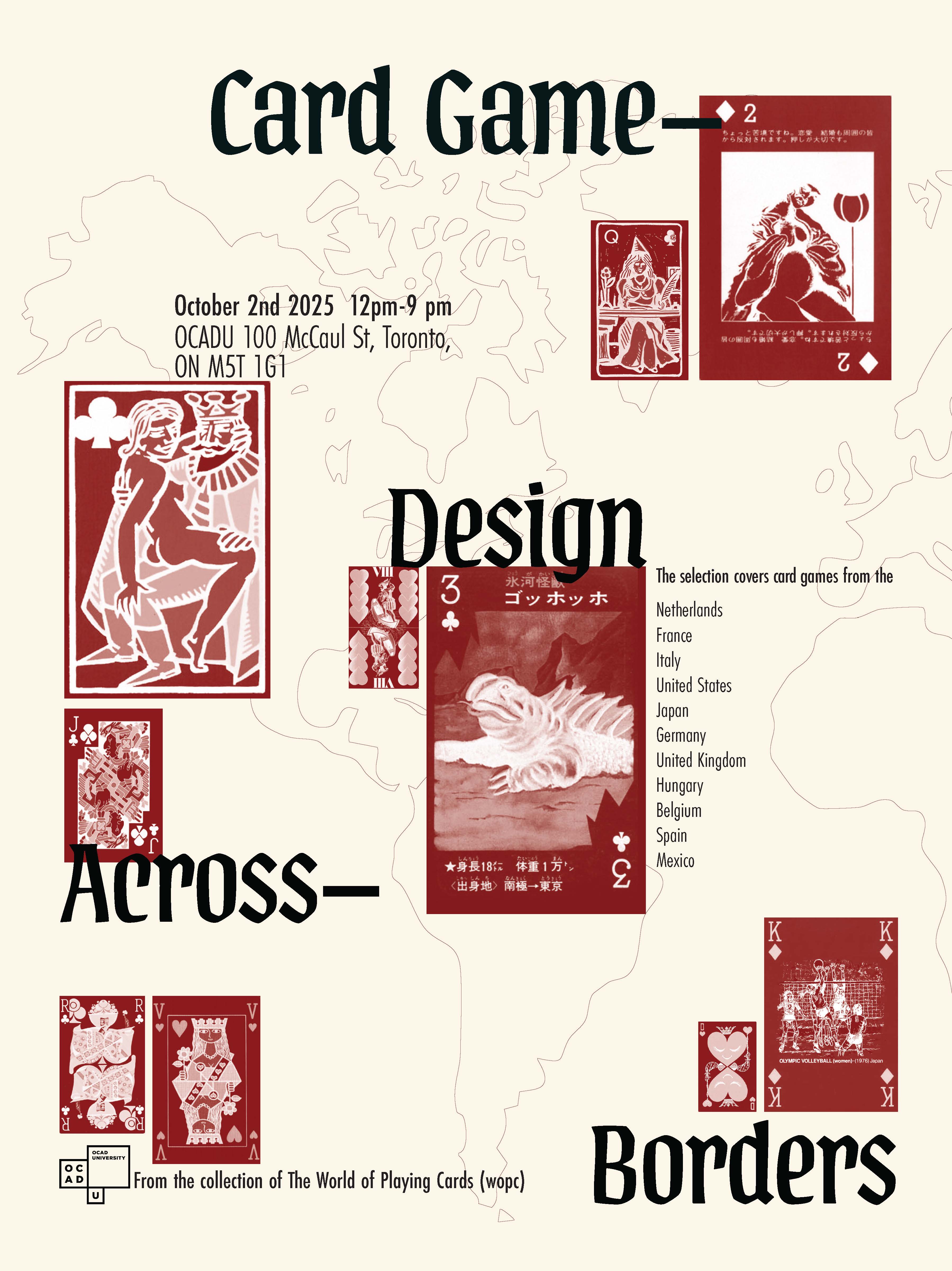
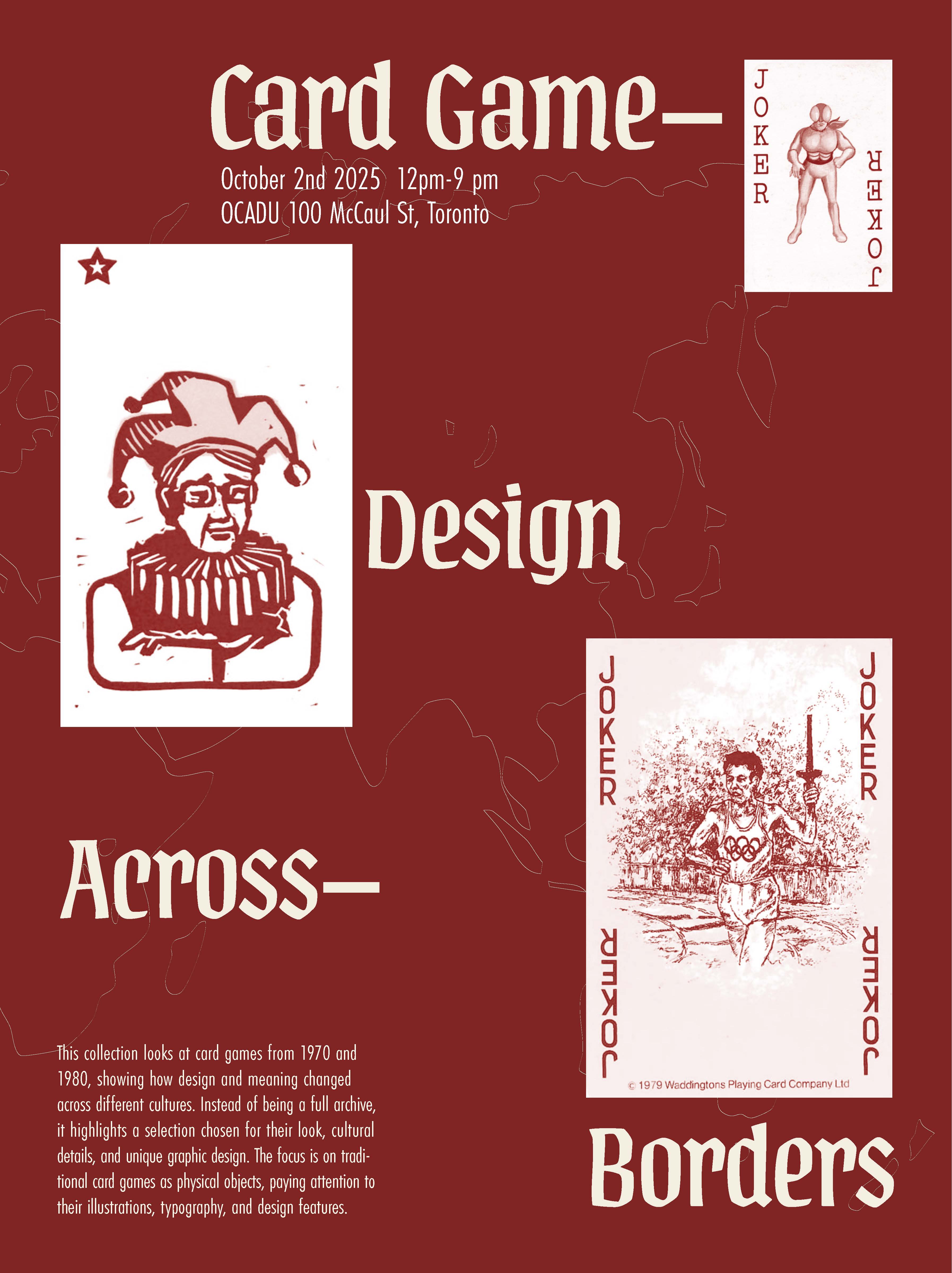
A two-faced hanging poster for a curated selection of traditional playing cards from the 1970s and '80s, drawn from the collection of The World of Playing Cards (WOPC), designed to be seen from both sides as it hangs in the exhibition space, looking at how card design and meaning shift across culture.
Front
Back
This collection looks at card games from the 1970s and '80s, tracing how design and meaning shift across different cultures. Rather than attempting a complete archive, the poster highlights a selection chosen for its look, cultural detail, and distinct graphic design, treating traditional cards as physical objects worth close attention to their illustration, typography, and design features.
Designed to hang in the gallery space with a distinct face on each side, cream and oxblood, sharing the same typographic system ("Card Game / Design / Across / Borders") inverted across the two faces, with a world outline and real card scans layered through both.
The colours of the card suits, hearts, diamonds, clubs, spades, gave a clear direction for the poster's palette: cream and oxblood red, pulled straight from the cards themselves.
Part of the analysis traced where each game was designed and how that origin shaped its look, which led directly to adding a world map outline to show the global connection between decks.
Real card scans were layered into the design, making the poster's theme legible at a glance and tying the whole composition back to its central idea. Overall, the analysis, especially colour, location, and the cards themselves, directly shaped every major decision in building the poster.