02 — Poster Design
A poster built around a BBC.com article exploring the neuroscience of why music feels good, made as a practice piece to cover everything a strong poster should do to engage a viewer: three-stage composition, pattern, and colour-matched concept.
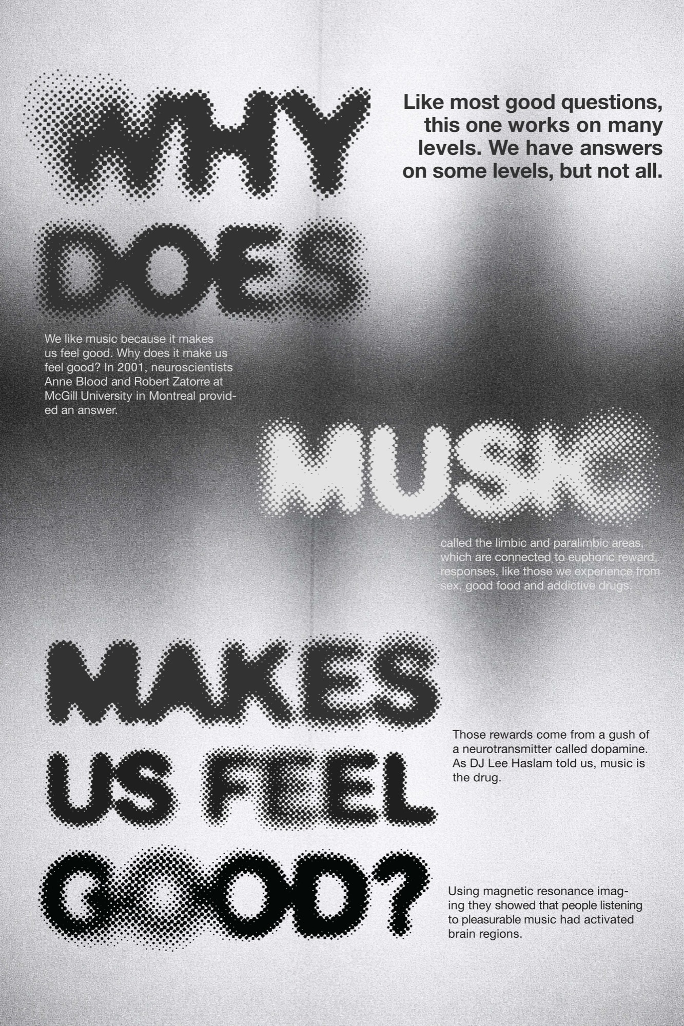
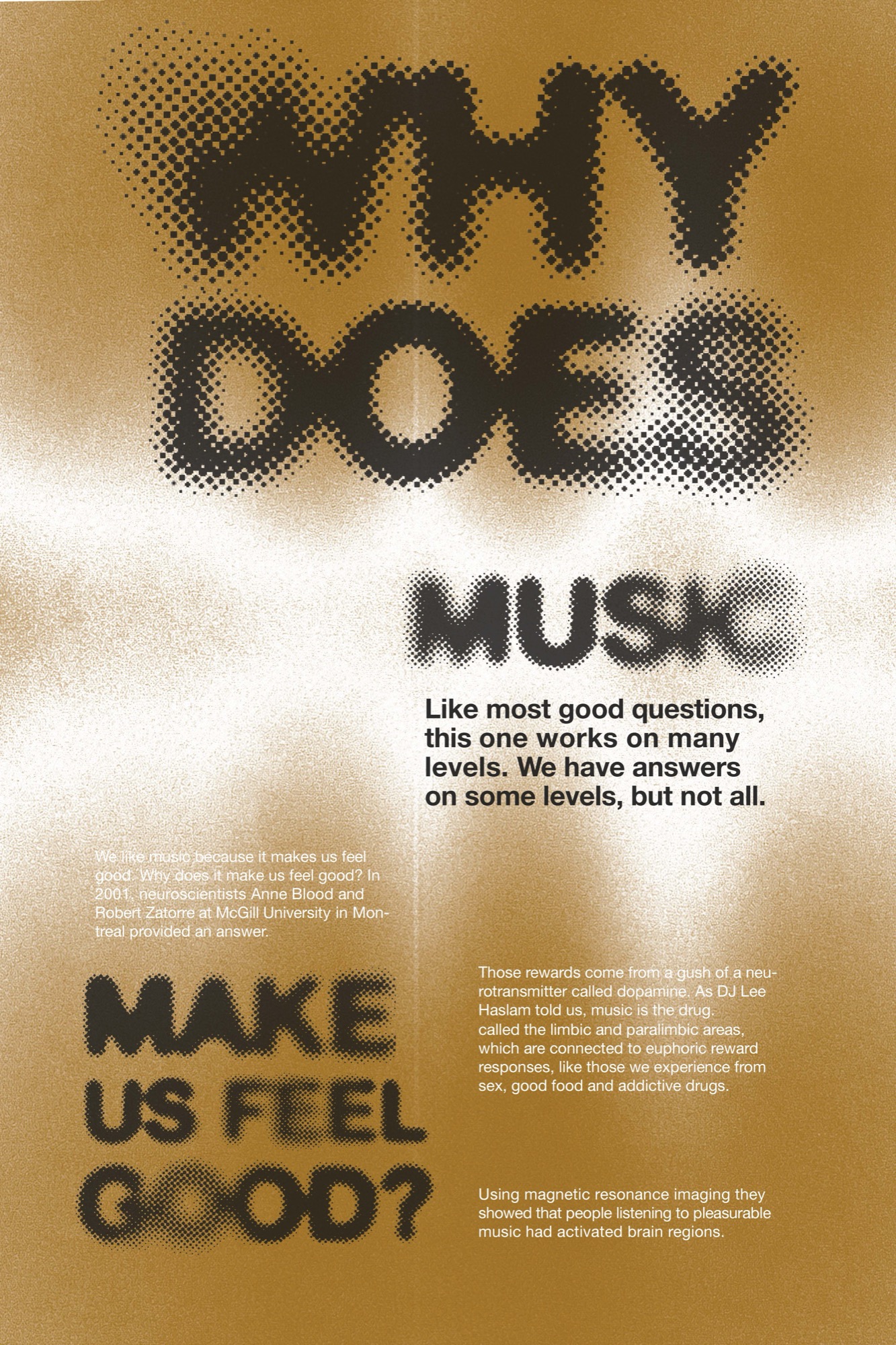
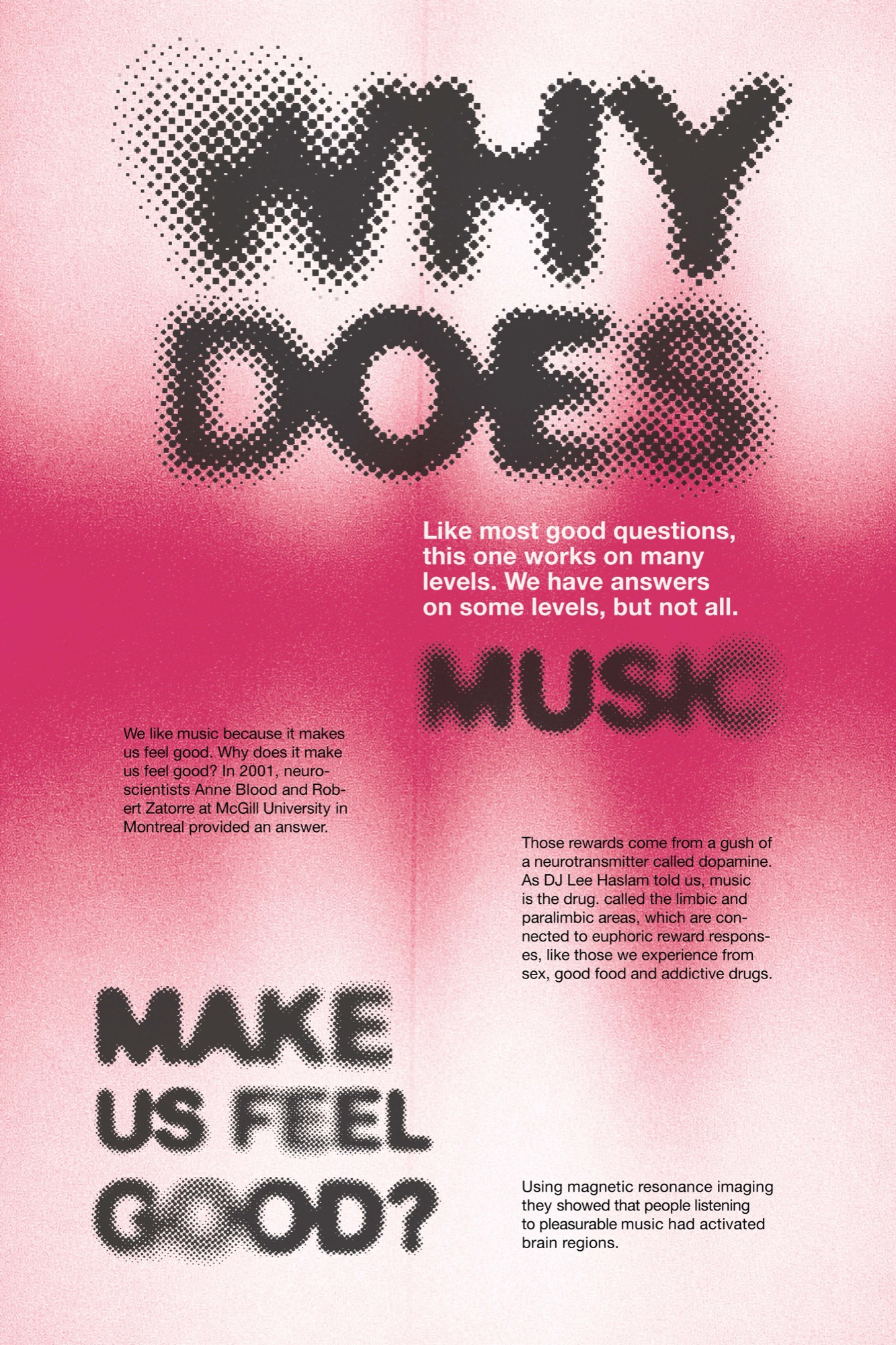
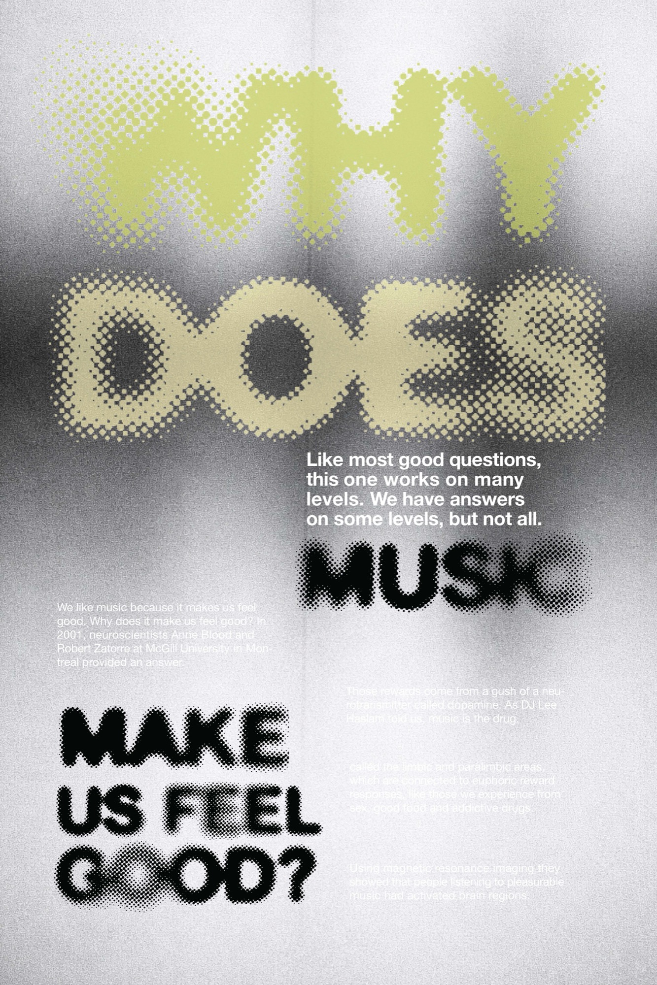
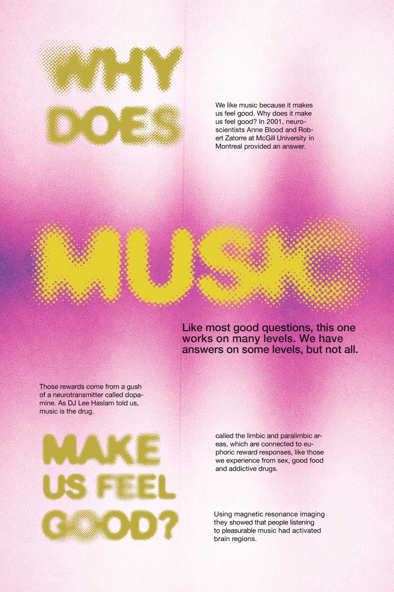
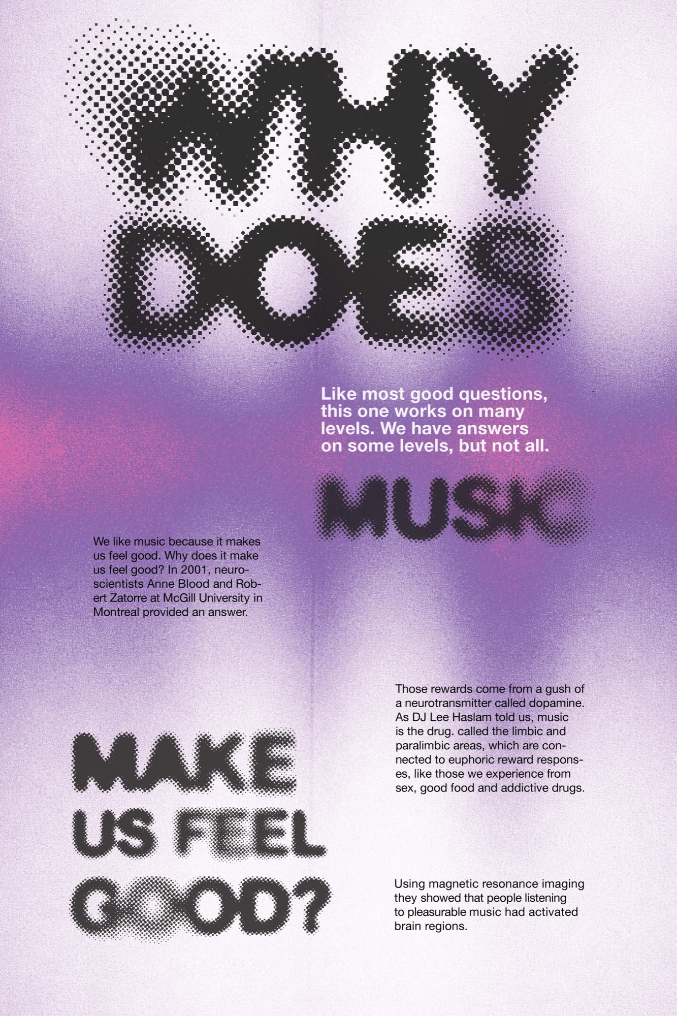
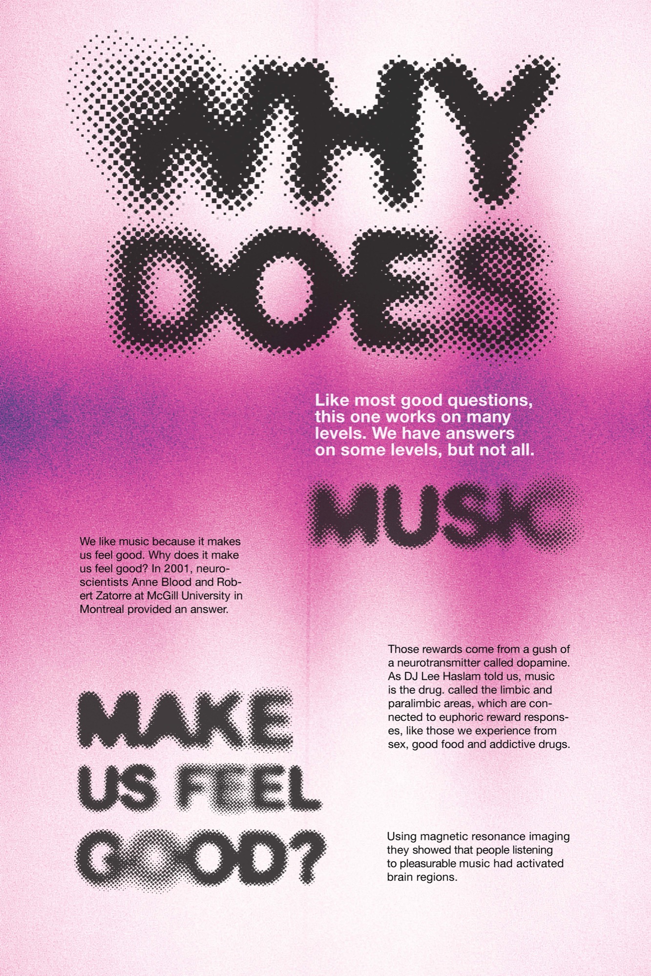
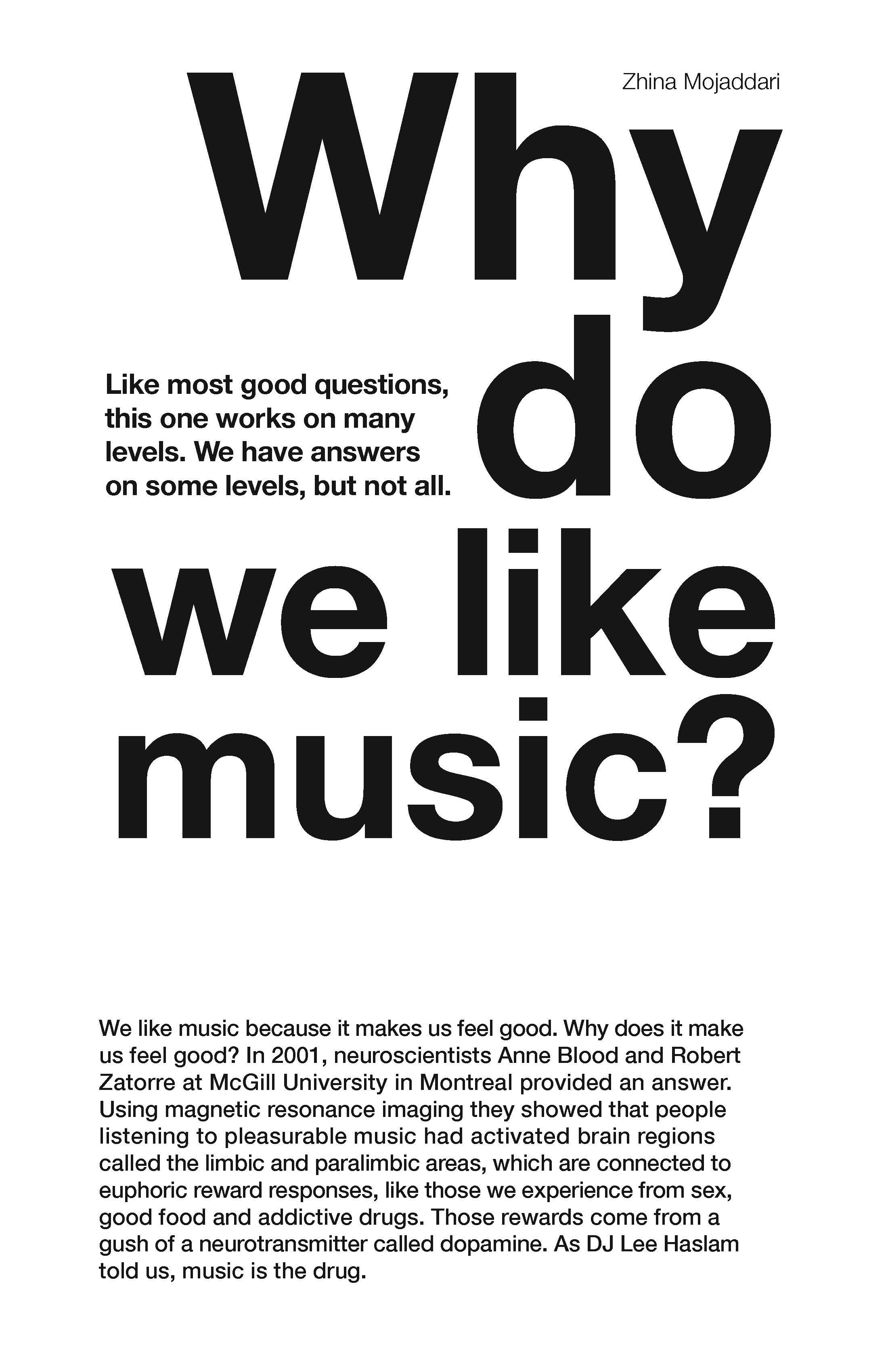
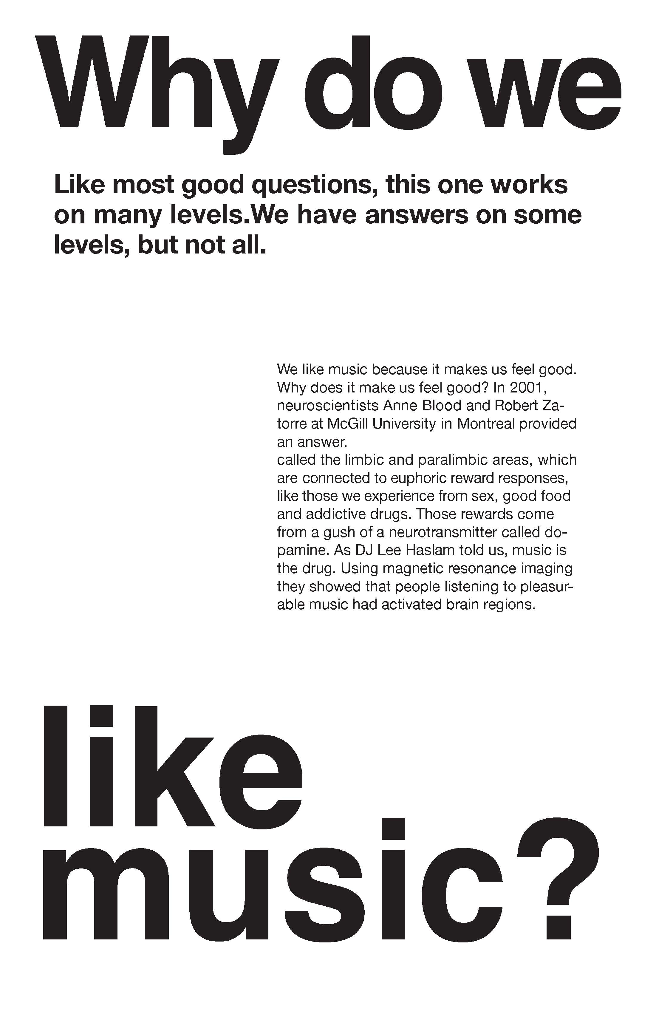
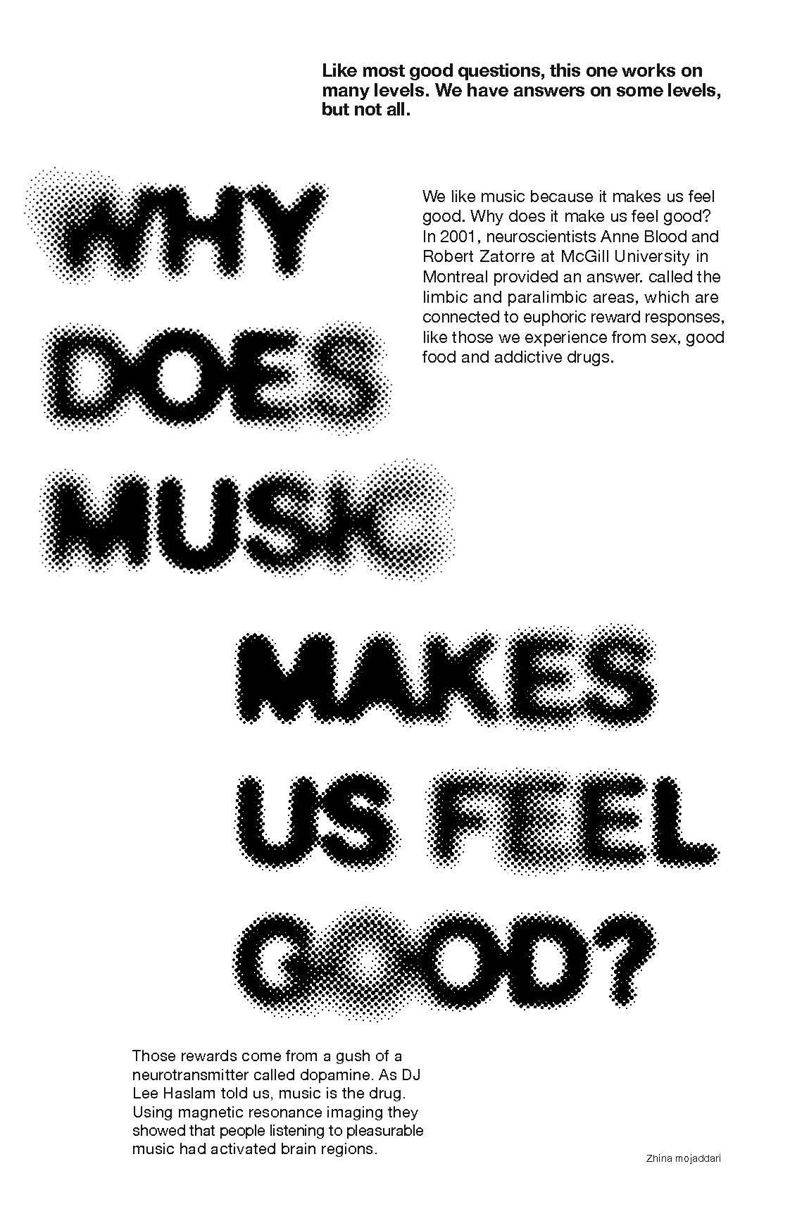
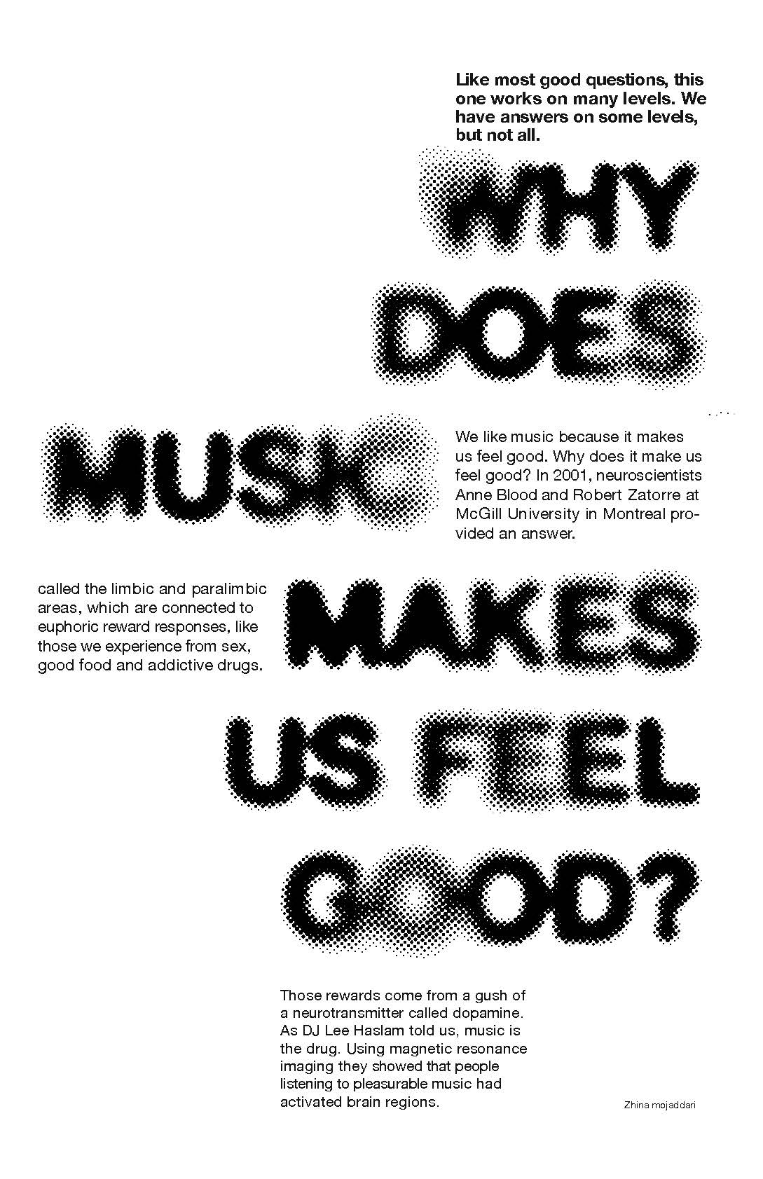
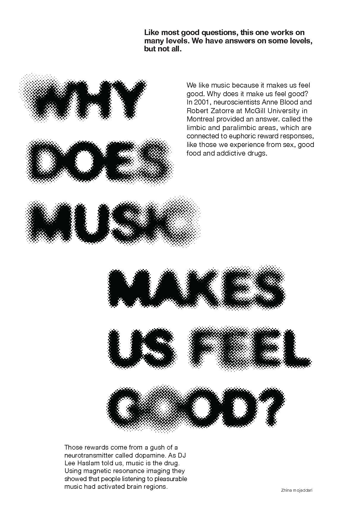
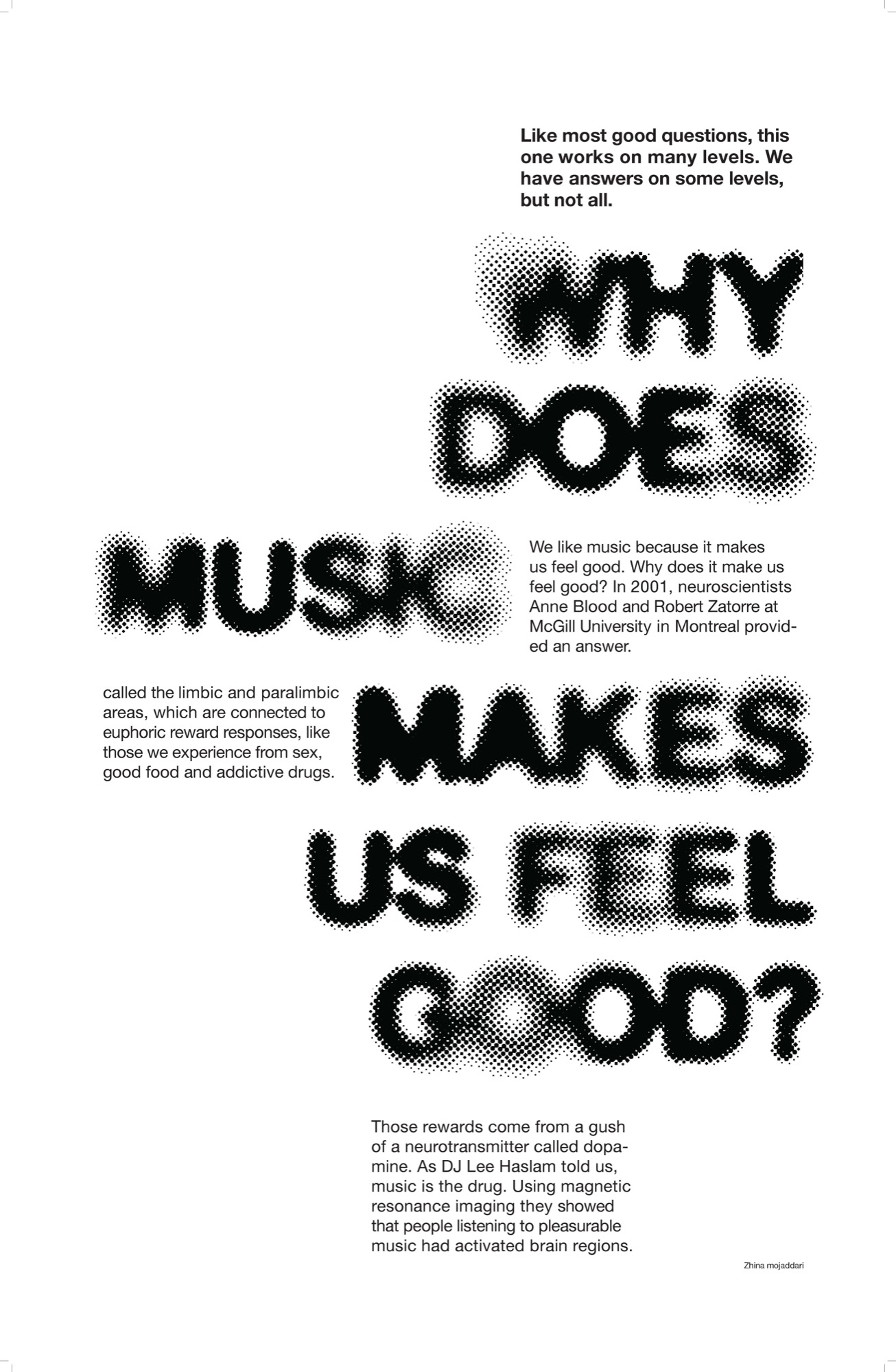
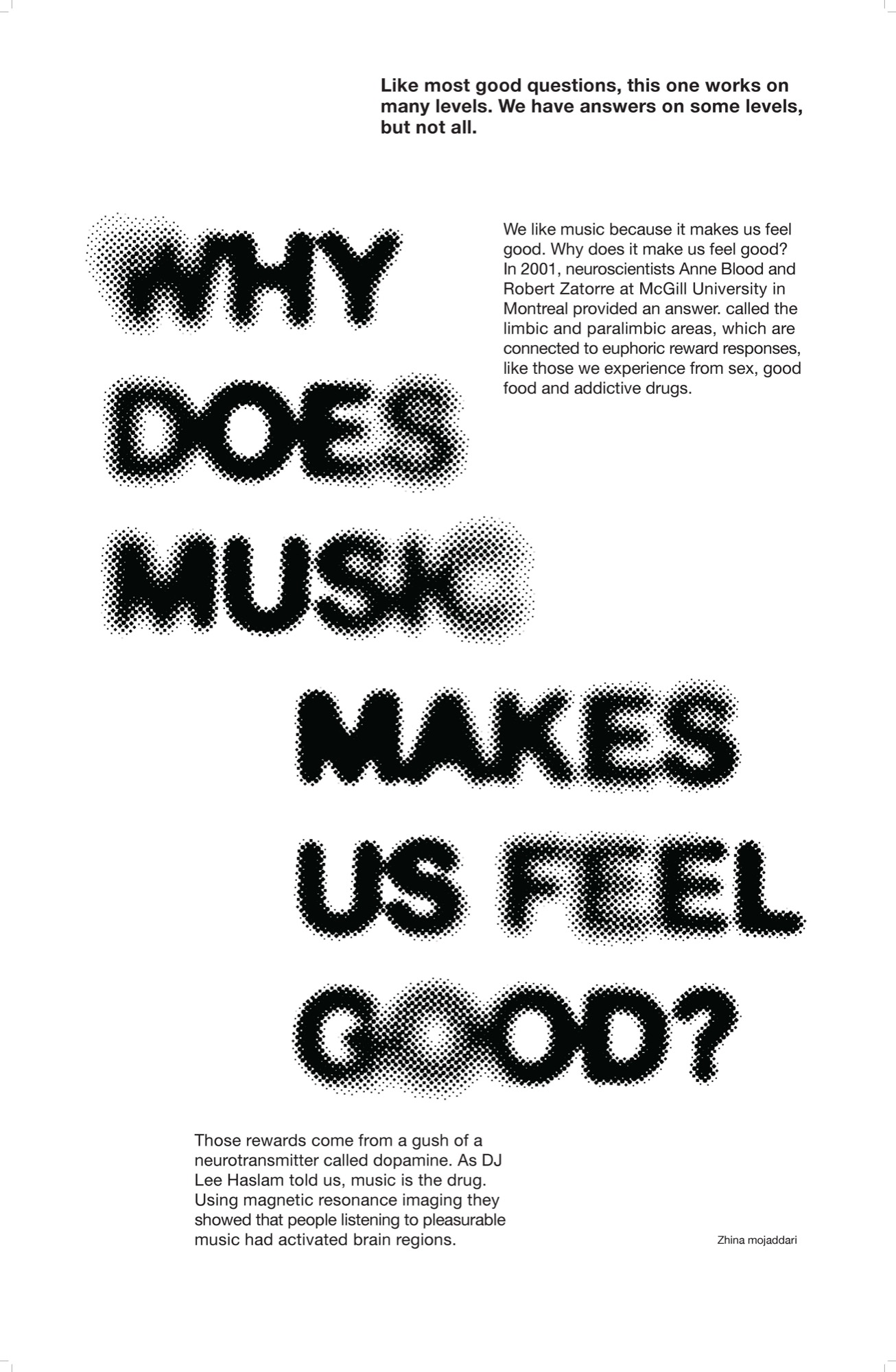
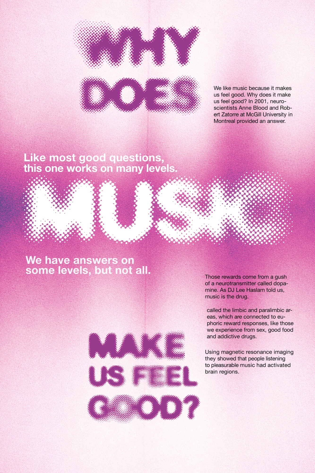
Built around a BBC.com piece on the neuroscience of musical pleasure. In 2001, neuroscientists Anne Blood and Robert Zatorre at McGill University used magnetic resonance imaging to show that people listening to pleasurable music activated the limbic and paralimbic brain regions, the same areas tied to the euphoric reward responses we get from sex, good food, and addictive drugs. Those rewards come from a rush of dopamine. As one DJ put it in the piece: music is the drug.
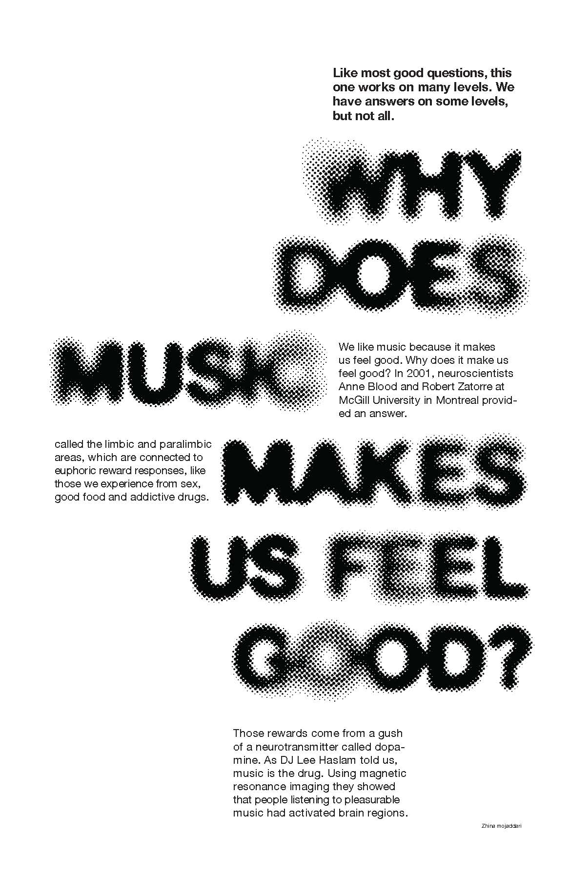
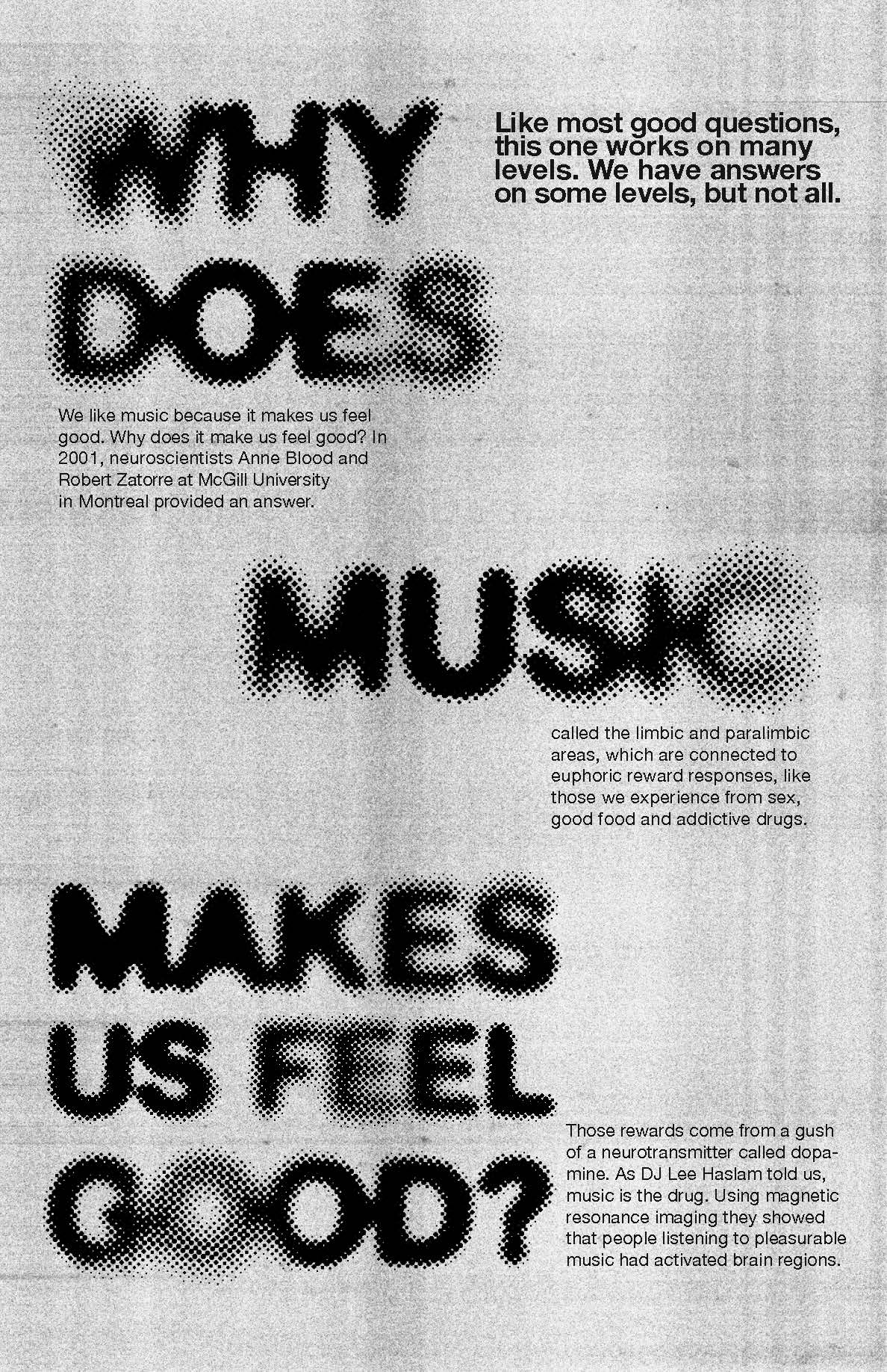
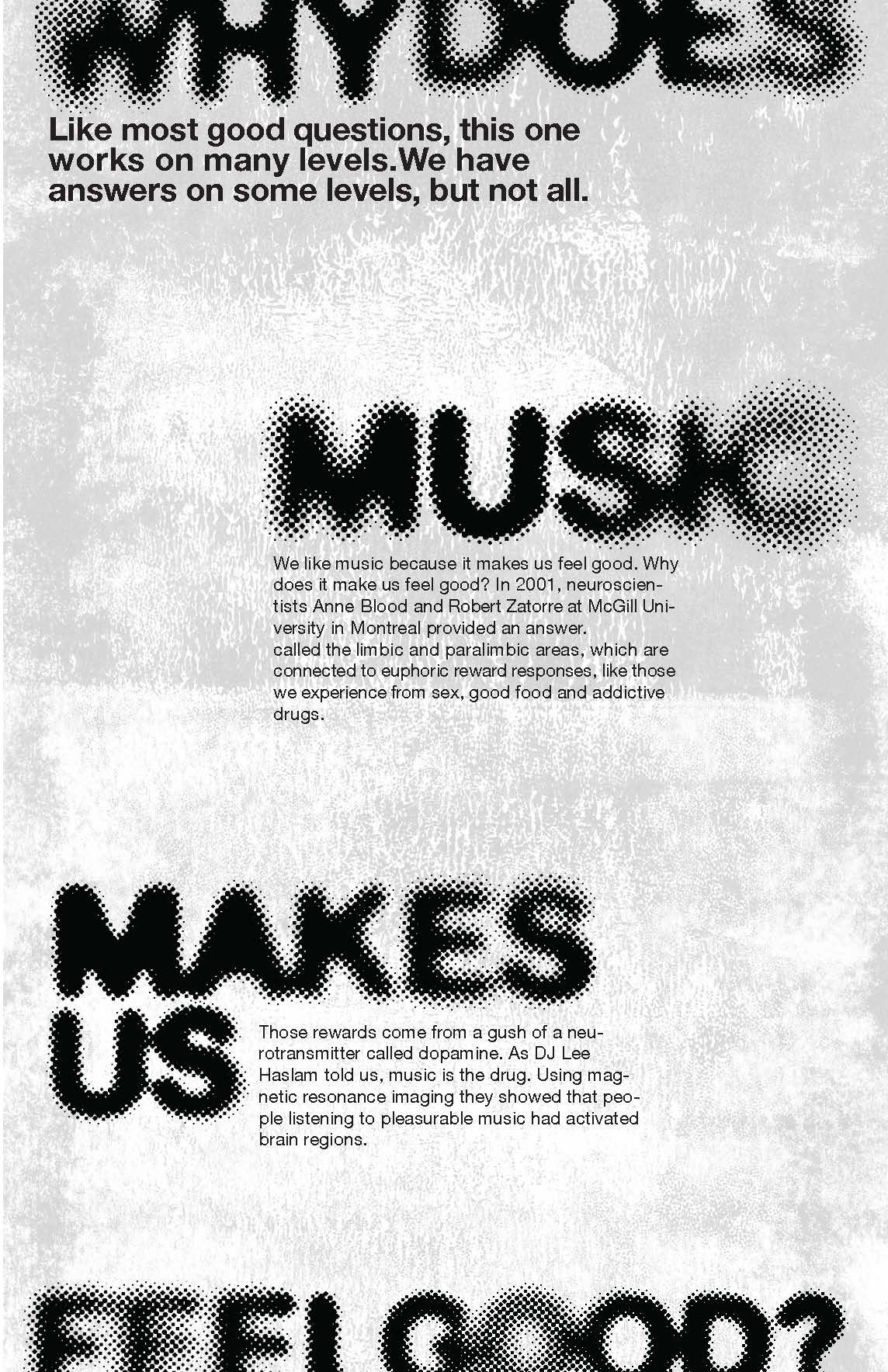
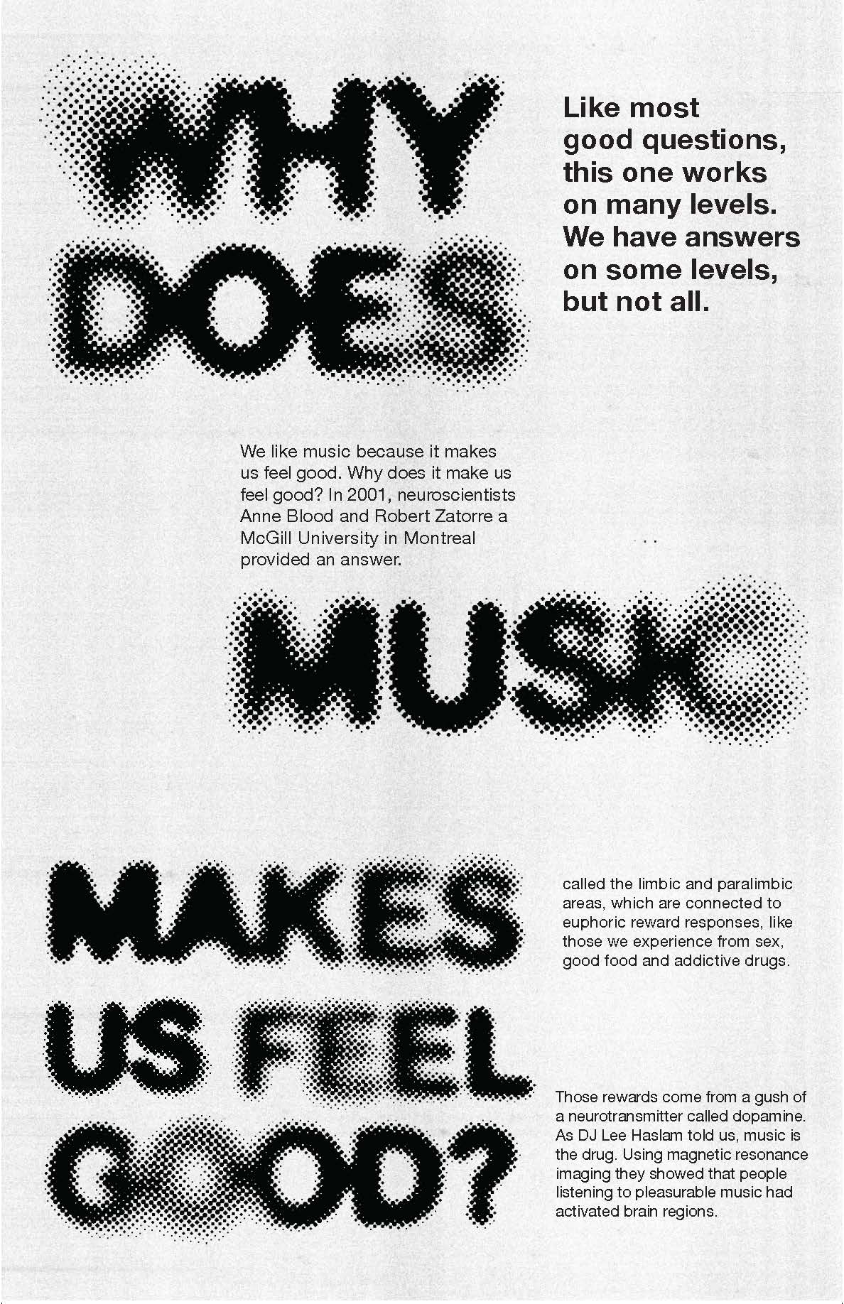
"Like most good questions, this one works on many levels. We have answers on some levels, but not all."
Article text set in smaller supporting blocks around three oversized, halftoned headline stages, letting the type carry the question-and-answer rhythm of the piece.
Tools and approach: halftone texture, three-act layout, editorial pairing.
Made as a practice exercise to hit every fundamental a strong poster needs in order to actually interact with a viewer, rather than simply present information.
The headline breaks into three distinct visual stages down the page, "WHY DOES," "MUSIC," "MAKE US FEEL GOOD?", pacing the reading like a question being asked, paused on, and answered.
A halftone dot pattern runs through every headline word, fading at the edges, giving the type a physical, printed texture instead of flat vector type.
Magenta and white pull from the visual language of sound and pleasure, a colour choice that reflects the chemical, dopamine-driven subject of the article itself.