Logotype
 Submark
04 — Brand Identity
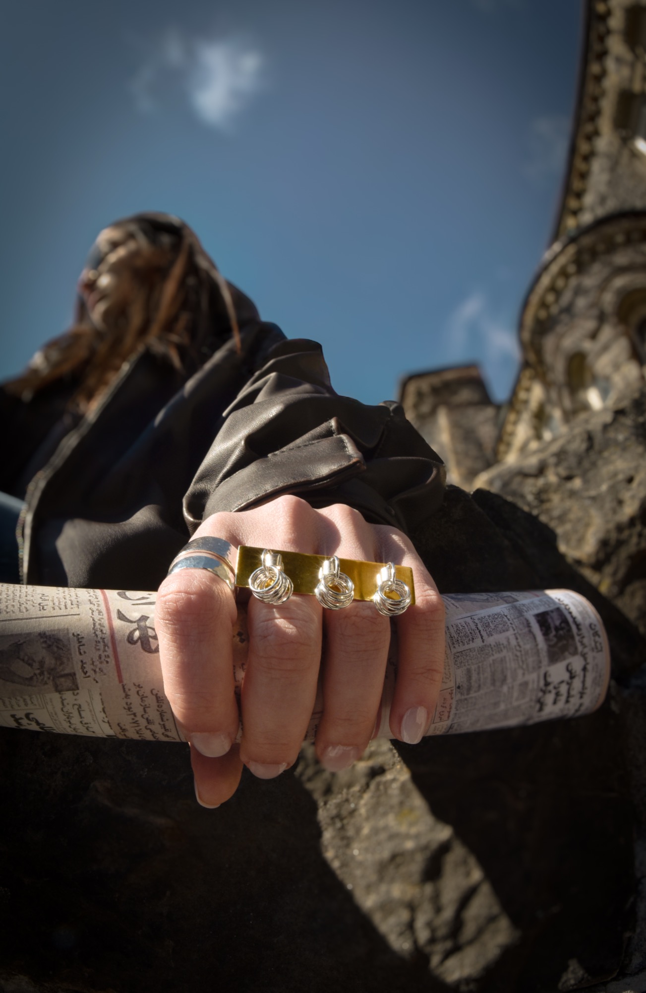
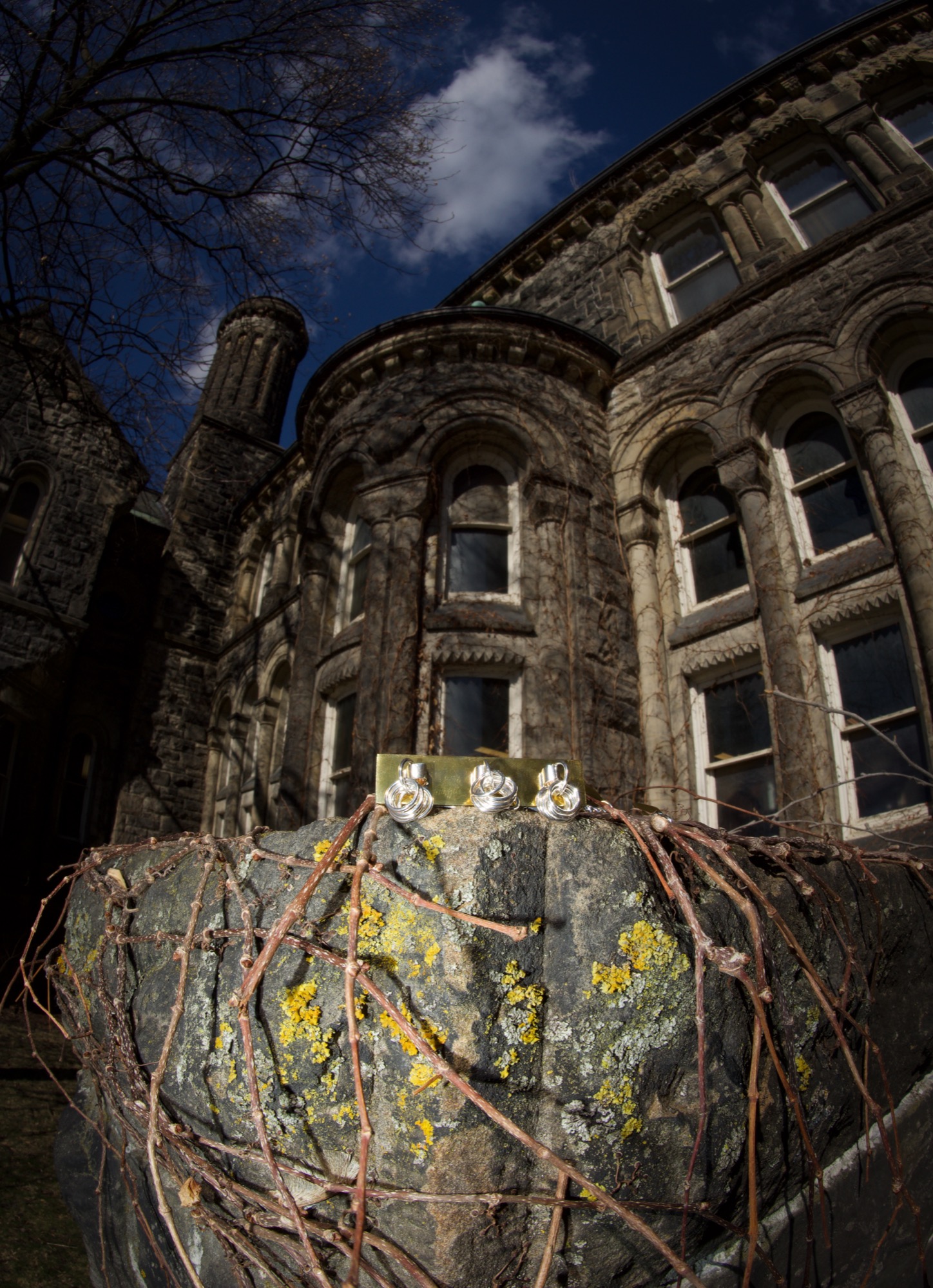
A jewellery brand built around the belief that everyday adornment has become too repetitive and too safe. Shakh o Shune is an identity for pieces that function as sculptural objects, drawing from Iranian nomadic craft traditions and designed to be worn by people who think outside the expected.
Logotype
Submark
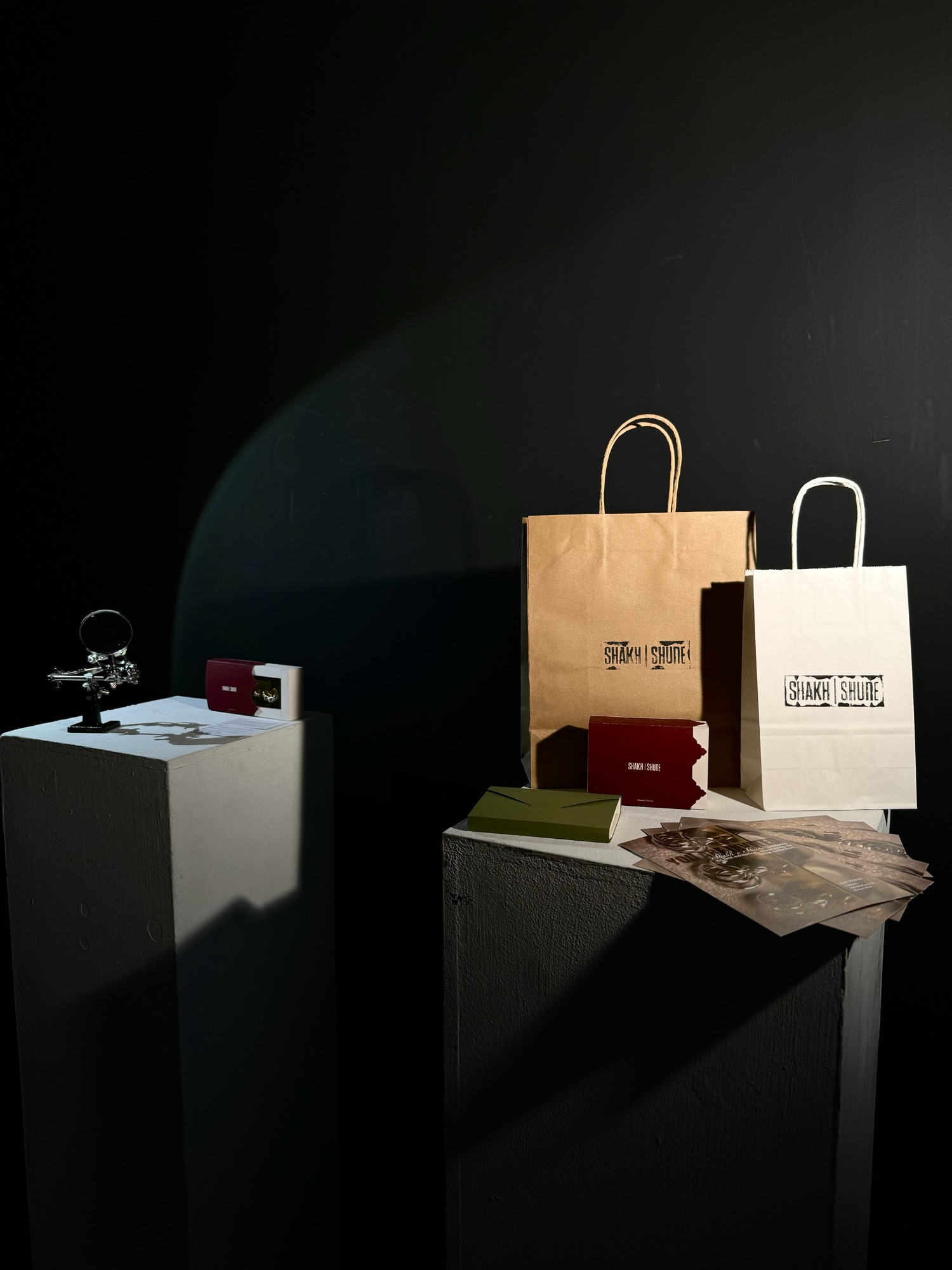
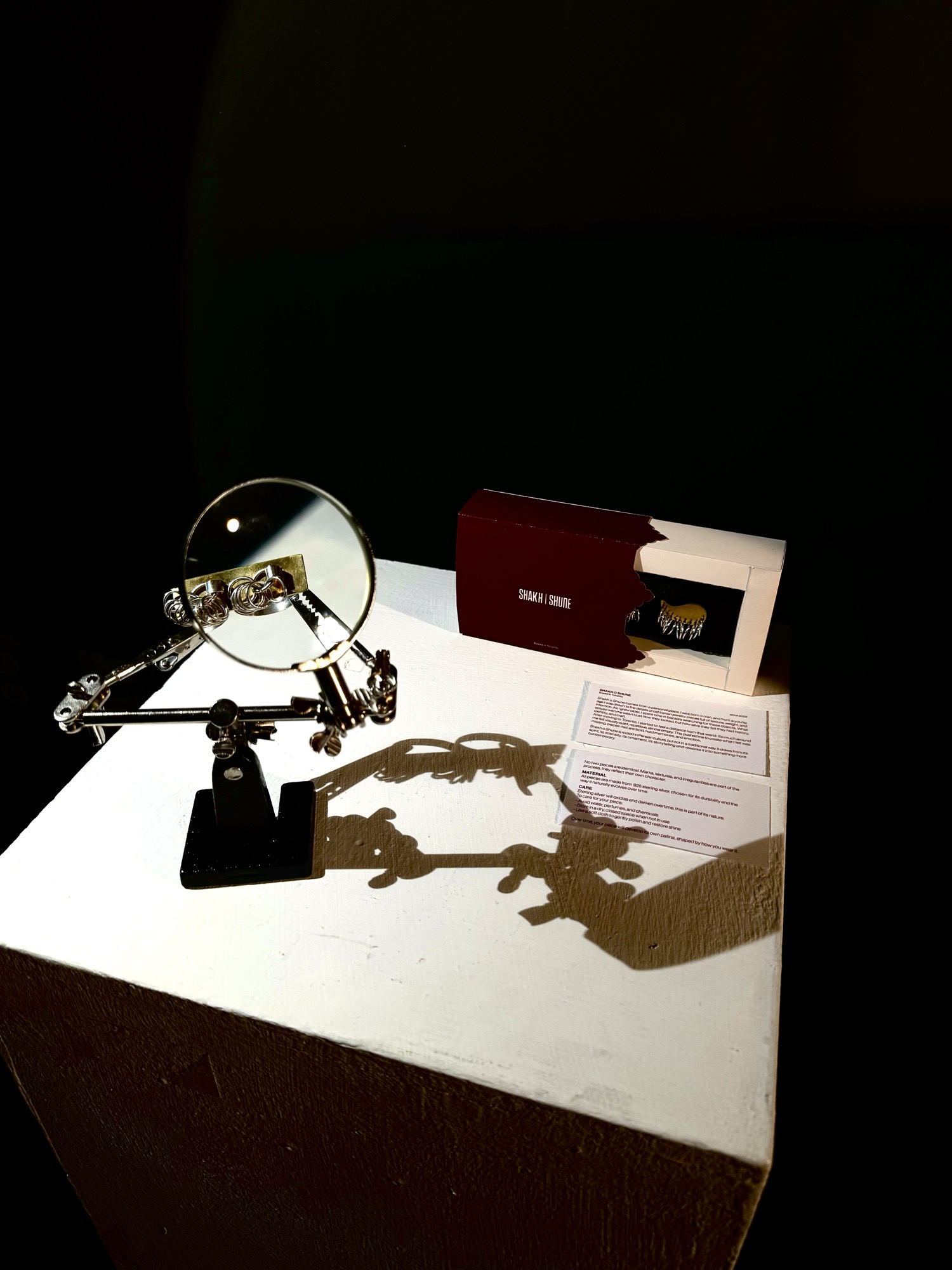
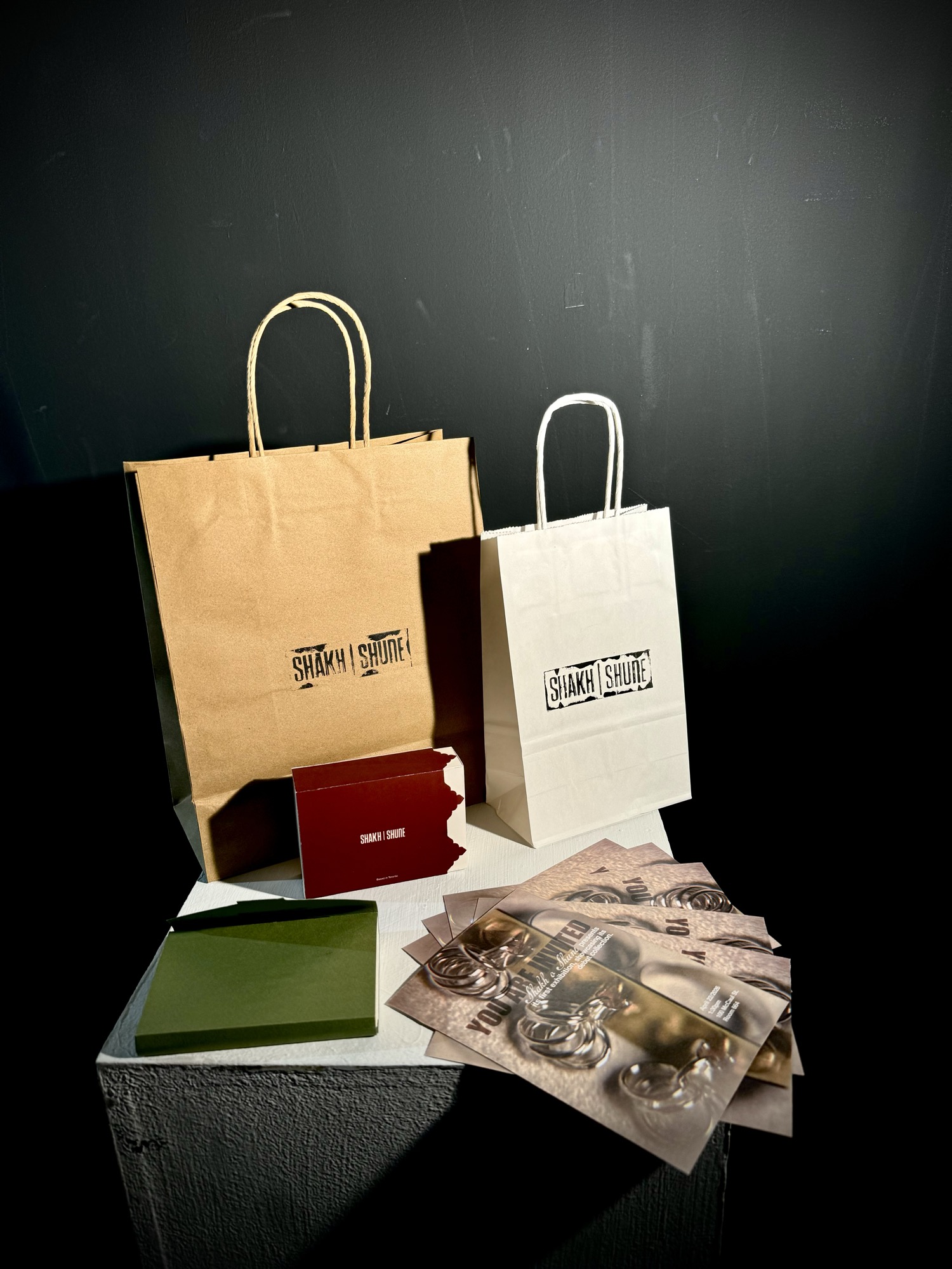
Brand identity for a handmade jewellery line, including packaging, logo, posters, and visual communication.
How contemporary jewellery can function as an extension of the body and a sculptural object, rather than a traditional decorative accessory. How the modern world became so aesthetically repetitive, and what it takes to push against that.
Everyday fashion and jewellery have become predictable. There is a need for pieces that challenge familiar forms and offer something unexpected, accessible to people across different backgrounds.
A jewellery brand and visual identity that feels exciting, conceptual, and emotionally engaging rather than safe, mass-produced, and familiar. Evoking strength, boldness, and uniqueness.
Iran has always been one of the great centres of art, culture, and craftsmanship, and jewellery making has been among its most exquisite traditions. For centuries, Iranian artisans have created pieces that reflect the region's rich history, cultural diversity, and intricate artistry.
Studying Iranian nomadic tribes as a source of inspiration opened a window into a world of jewellery shaped by symbols, beliefs, geography, and daily life. Each group carries a distinctive visual language, and these pieces are more than adornments. They carry identity, memory, and heritage, used for spiritual protection, expressions of status, and cultural storytelling.
Department of Islamic Art. "Turkmen Jewelry." In Heilbrunn Timeline of Art History. New York: The Metropolitan Museum of Art, 2000. metmuseum.org/toah/hd/turk/hd_turk.htm
I began by asking a few questions that may seem simple, but they hold the true value of any brand and they are not easy to answer.
They are unique and handmade, bold rather than derivative. The aim is to step outside the design comfort zone and create pieces that some might consider unconventional, pieces that do not copy what already exists.
Only one piece of each design is ever made. Some items may be similar in approach, but none will ever be identical. Each piece is truly unique. Many brands with comparable values are very expensive and inaccessible. Shakh o Shune aims to maintain high quality while keeping jewellery as affordable as possible, so people from different backgrounds can enjoy it.
The idea of breaking away from social norms and stepping outside the comfort zone that society often imposes on us.
Artists who have learned to think outside the box, collectors who appreciate originality, and people looking to express themselves in a bold and distinctive way.
Strength, boldness, and uniqueness.
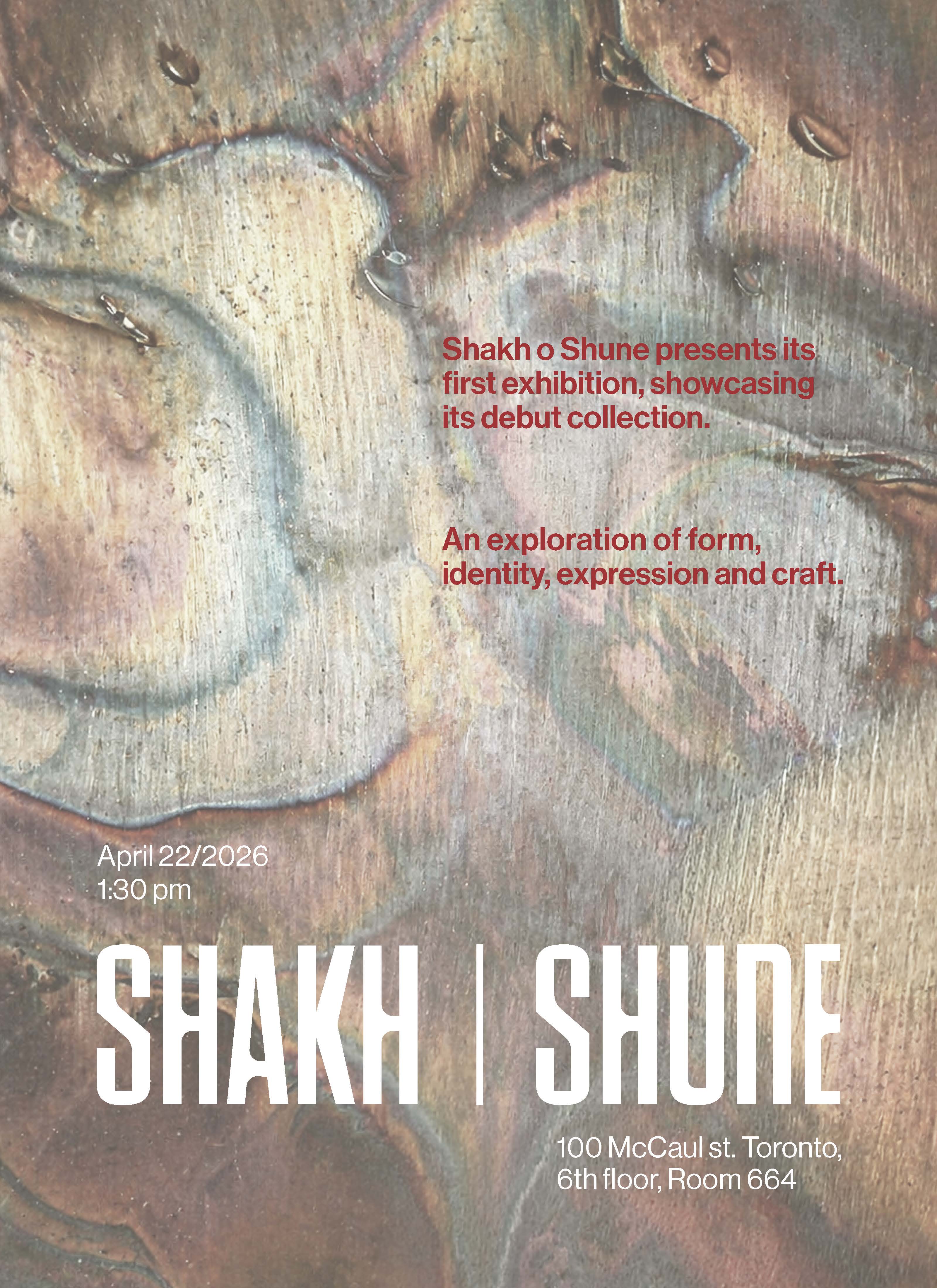
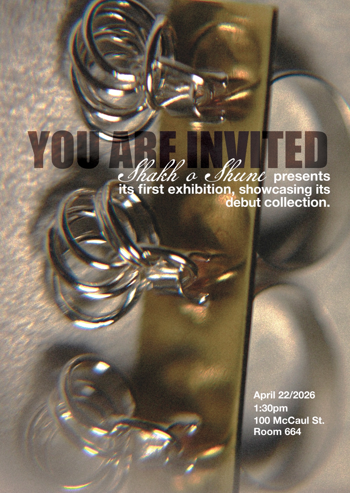
This poster was originally designed for the initial exhibition. Looking at different brands with similar goals for inspiration, trying to find a consistent visual approach they all shared, one thing that stood out was the use of script-style fonts alongside other typefaces as a way to create tension and personality within a single composition.
An invitation designed to be sent both digitally and physically. The final wordmark draws from three typefaces: Goodland Regular, Pressio Stencil No. 33 Medium Condensed, and Baucher Gothic URW Regular, all modified significantly.
The result is a sans-serif style that mixes sharp edges with softer curves. The sharp parts reflect the bold, heavy feeling of the jewellery, while the curves make it feel more wearable and connected to the body. That contrast between sharp and soft defines the identity of Shakh o Shune.
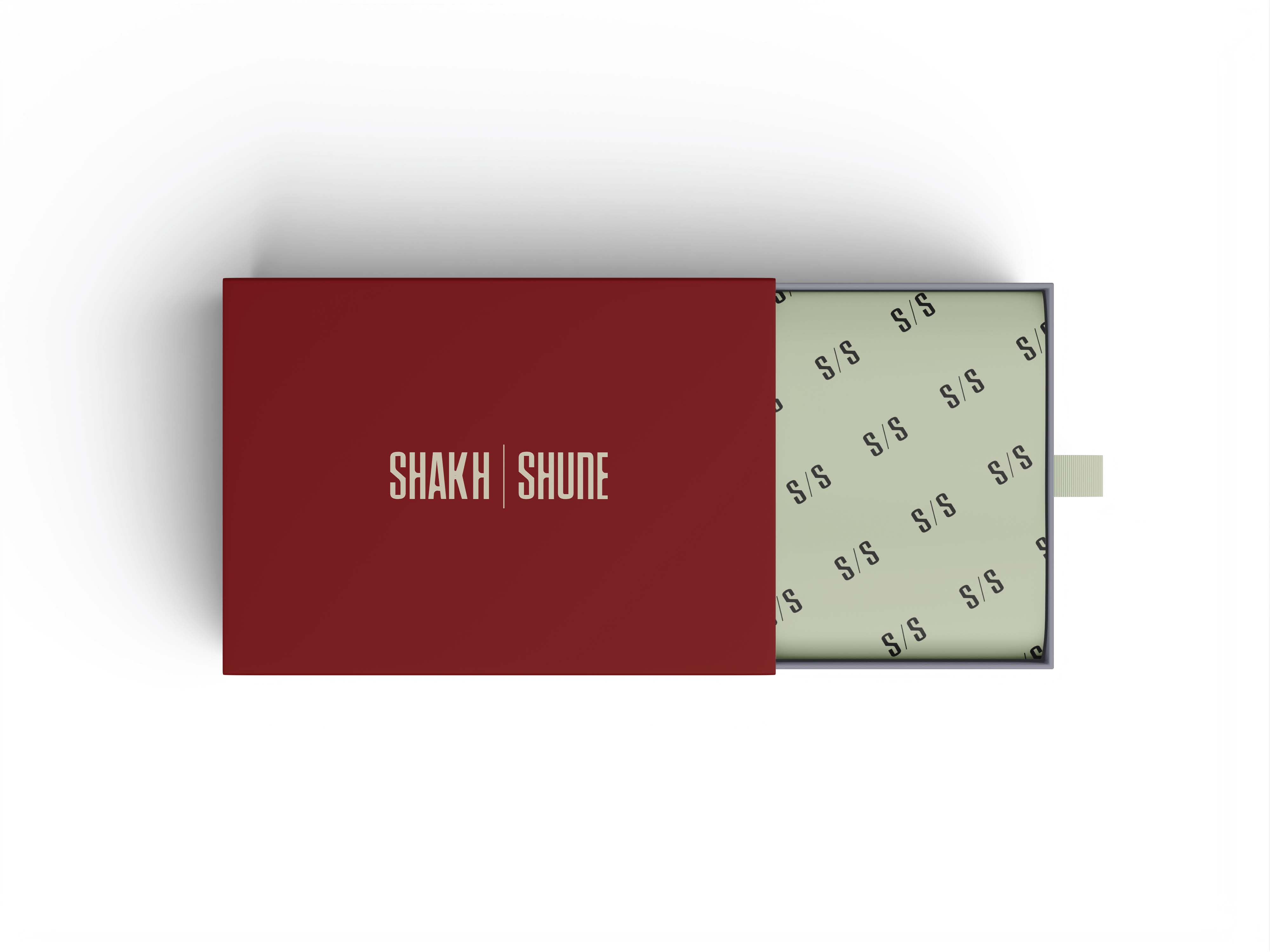
The submark "S/S" comes directly from the main wordmark, designed for smaller uses where the full wordmark does not fit as well, while keeping the same identity intact.
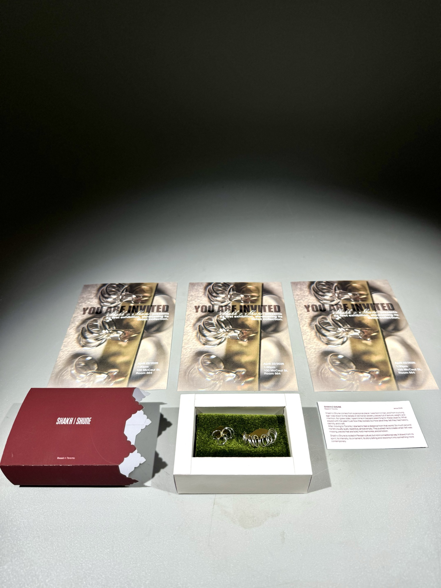
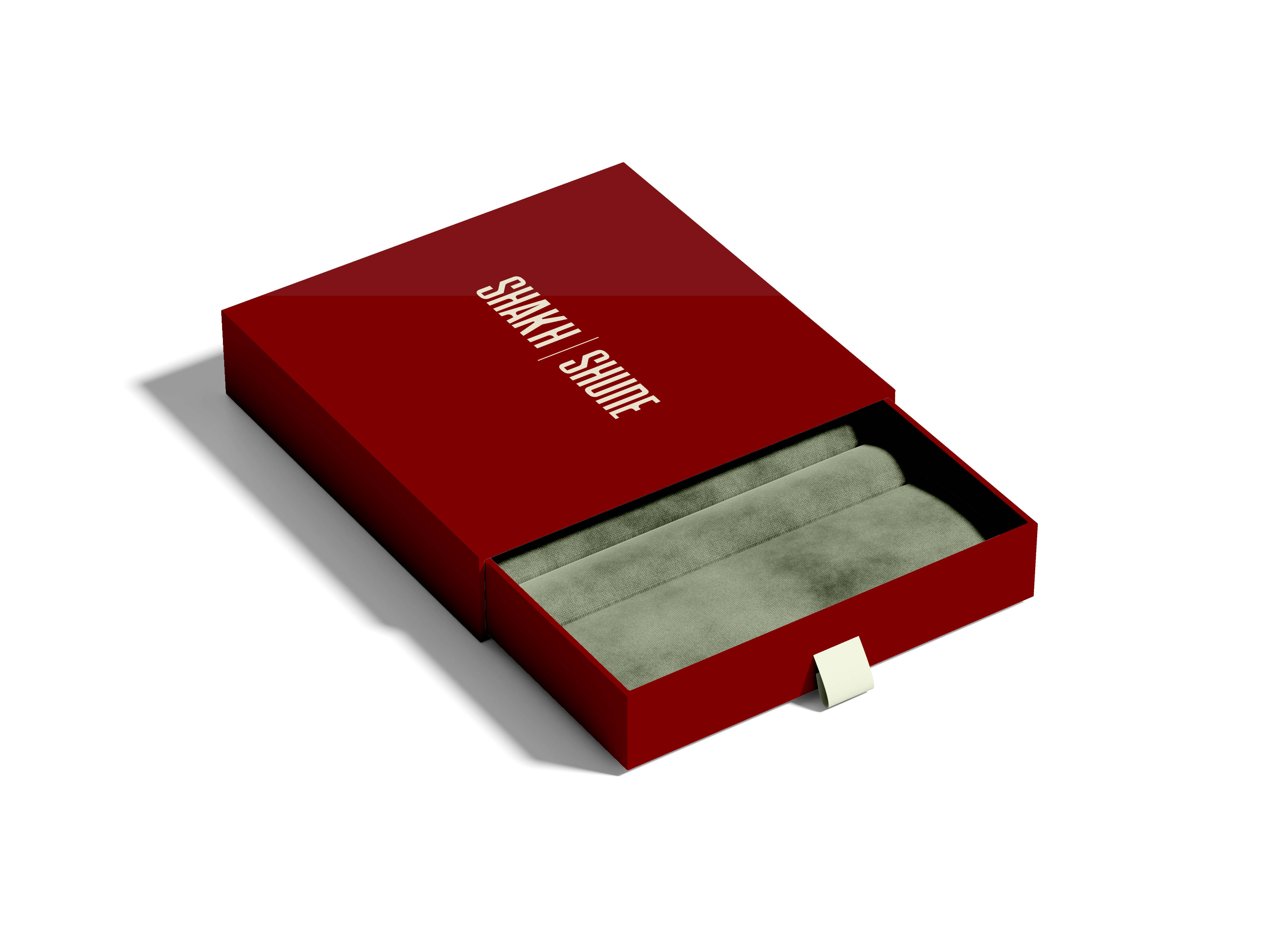
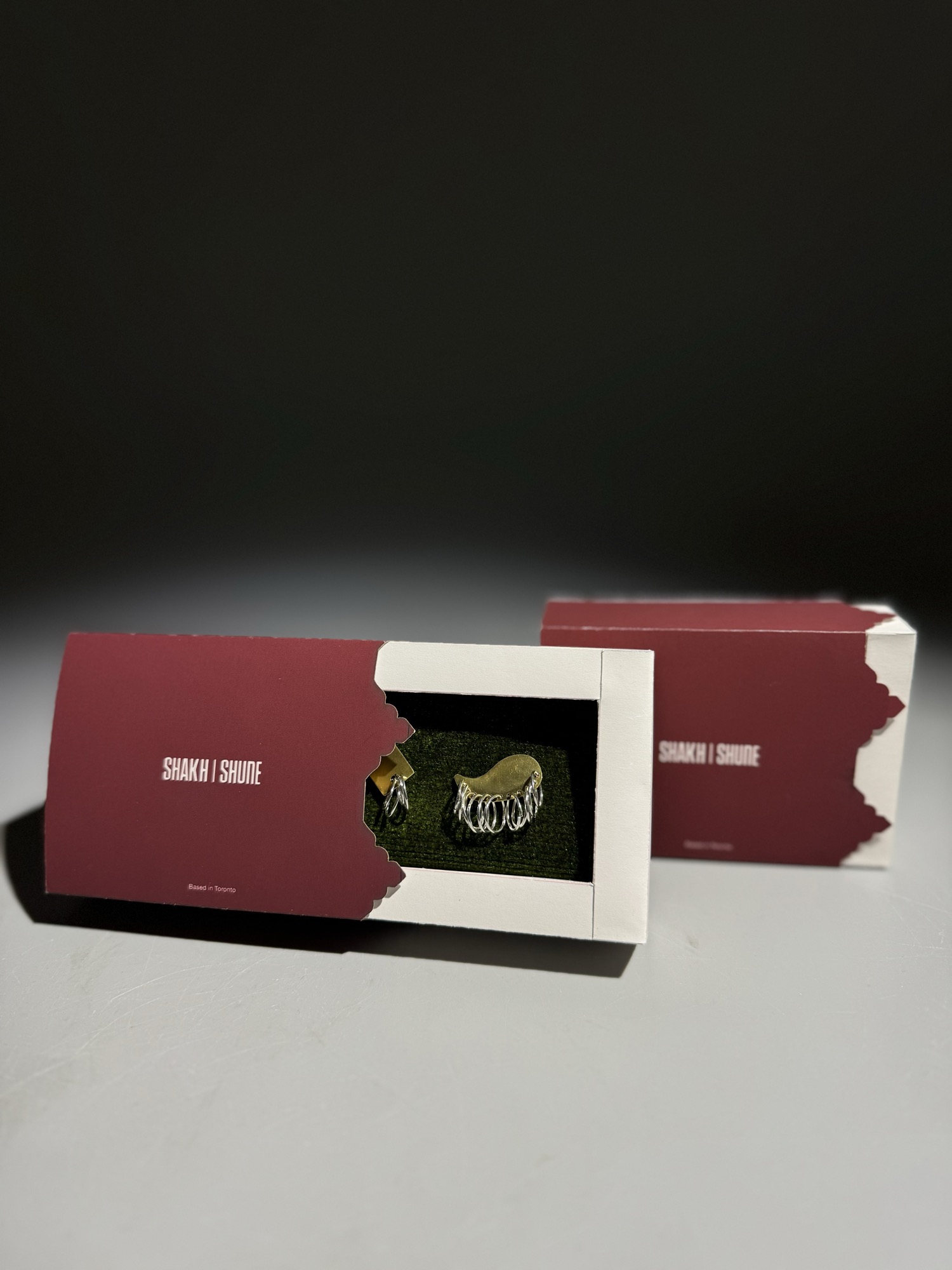
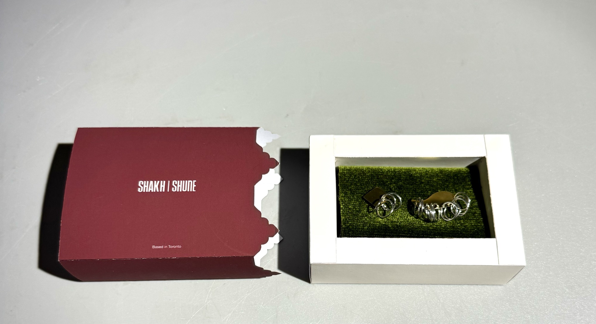
The packaging uses the brand's colour palette alongside a pattern that gives it a distinct identity and a Middle Eastern-inspired feel, setting it apart from conventional jewellery packaging.
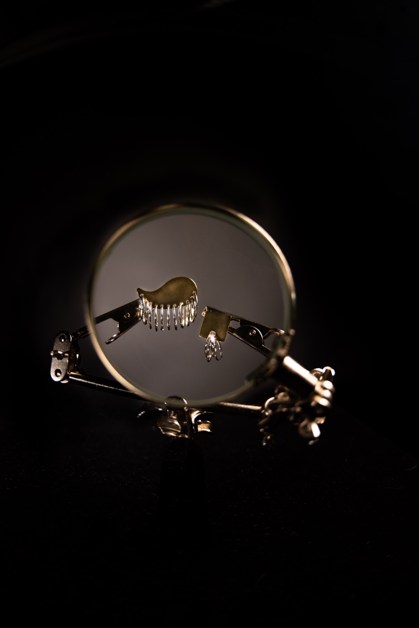
The exhibition was designed to give viewers a full experience, inviting them to watch a video about the process of making the jewellery while also seeing the pieces in person. This approach creates a stronger connection between the audience and the brand.
The video is a blended piece of the making process, showing how each piece is created by hand.